Tankers and pipelines
There are a few twitter accounts pushing tankers and piplines and today they’re going all out with the information. I’m all for progress, but if it’s so safe and economically sound, why are they fudging the figures?
Like this one. On the left is the tweet showing the many many more tankers in Norway than in BC. 25 seconds on Google Maps and I’ve got the 2 maps to the same scale on the right. Also, Norway is a lot of open ocean, BC is a lot of narrow passages.
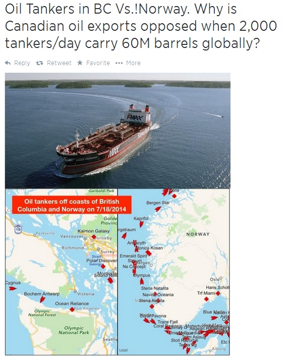

If this is so safe, why are they fudging the maps to make it look like this?
It reminds me of these maps.

Image from David Suzuki’s website, click on it to see the article.
Then they tweeted this:

That’s a great point, why aren’t we selling to Japan? Wait a minute, 2012, did Japan have any reason to increase the amount of natural gas they use? Something about a recent earthquake shutting down 11 nuclear reactors?
Now Japan only pays about 3 times the US. Which could be due to the fact the US has natural gas and Japan doesn’t. Then there’s the cost of moving the gas. I’m guessing getting it across the 49th parallel is easier than the Pacific.
So with all these tweets how about using real numbers and comparing like with like. Use maps that are to scale and don’t have mysterious disappearing islands. This isn’t Lost you know. And use current figures and projected figures for the future, not a historical jump that was due to a massive earthquake.
If for no other reason than this, I would oppose the pipeline and the tankers. If you have to lie about it then there’s probably a whole lot more going on that you can’t fudge the numbers for and are keeping quiet.
Leave a Reply